
No products in the cart.
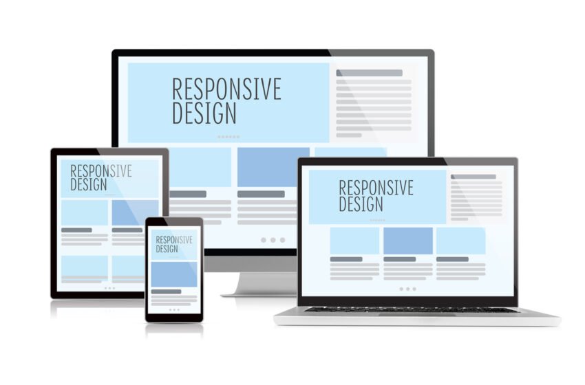
In today’s digital landscape, responsive design has become a fundamental requirement for creating successful websites. With the dramatic rise in mobile device usage, businesses can no longer afford to design exclusively for desktop experiences. A mobile-first world demands that websites function seamlessly across diverse devices, screen sizes, and resolutions. Responsive design ensures that users receive an optimal browsing experience, whether they are accessing a website from a smartphone, tablet, laptop, or desktop. Beyond aesthetics, responsive design directly impacts user experience, engagement, search engine rankings, and conversion rates. In this comprehensive guide, we explore why responsive design is critical in a mobile-first world, the benefits it provides to both users and businesses, and best practices for implementing responsive web design effectively.
Understanding the Mobile-First World
The mobile-first world refers to the reality that the majority of internet traffic now originates from mobile devices. Smartphones and tablets have become primary tools for accessing information, making purchases, communicating, and consuming content. This shift in user behavior has profound implications for web design, marketing strategies, and digital accessibility. Users expect websites to be fast, visually coherent, and fully functional on smaller screens. Failure to meet these expectations results in frustration, high bounce rates, and missed opportunities for engagement and conversions. Additionally, search engines have adapted to this trend by prioritizing mobile-friendly websites in search rankings. Mobile-first design is no longer optional; it is a necessity for businesses that wish to maintain visibility, credibility, and user satisfaction in a competitive online environment. Understanding the mobile-first landscape is the first step toward embracing responsive design as an essential strategy for digital success.
The Core Principles of Responsive Design
Responsive design is based on several key principles that ensure websites adapt fluidly to different screen sizes and devices. Unlike fixed layouts, responsive design uses flexible grids, scalable images, and CSS media queries to dynamically adjust content. This approach allows the same website to provide an optimal viewing experience across a wide range of devices without the need for separate mobile and desktop versions. Key aspects of responsive design include fluid layouts that proportionally resize content, flexible images that scale appropriately, and media queries that apply specific styling rules based on screen dimensions. Together, these principles create a cohesive and user-friendly experience that maintains functionality, readability, and aesthetics across all devices. By adhering to these principles, businesses can deliver websites that are visually consistent, accessible, and capable of meeting modern user expectations.
Enhancing User Experience Through Responsiveness
User experience is the cornerstone of effective web design, and responsive design plays a crucial role in enhancing it. Users expect websites to load quickly, display content clearly, and allow easy navigation, regardless of device. Responsive design eliminates the frustration of distorted layouts, unreadable text, or inaccessible buttons, creating a smooth and enjoyable browsing experience. A positive user experience encourages longer visit durations, higher engagement, and increased likelihood of completing desired actions such as purchases, form submissions, or content sharing. Conversely, a non-responsive website can alienate users, reduce trust, and increase bounce rates. By providing an intuitive and consistent experience across devices, responsive design strengthens the relationship between users and brands, fostering loyalty and supporting long-term digital success.
The SEO Benefits of Responsive Design
Responsive design is not only essential for user experience but also for search engine optimization. Search engines like Google prioritize mobile-friendly websites, using mobile-first indexing to determine rankings. A responsive website consolidates desktop and mobile versions, ensuring that content, metadata, and links remain consistent, which improves crawlability and indexing. Non-responsive websites risk lower rankings, decreased visibility, and reduced organic traffic. Additionally, responsive design reduces duplicate content issues that can arise from maintaining separate mobile and desktop sites. By integrating responsive design into web development, businesses enhance SEO performance, improve search engine rankings, and increase the potential to attract organic traffic from diverse devices. Effective SEO combined with responsive design creates a strong foundation for visibility, engagement, and conversion.
Improving Conversion Rates with Responsive Design
Conversion rates are directly influenced by the usability and accessibility of a website. In a mobile-first world, users are more likely to abandon websites that are difficult to navigate or poorly formatted for their device. Responsive design mitigates these issues by ensuring that buttons, forms, images, and text are displayed correctly and function as intended on any device. Smooth navigation, readable content, and easily clickable interactive elements enhance the likelihood of users completing desired actions. Whether the goal is completing a purchase, signing up for a newsletter, or downloading a resource, responsive design facilitates a frictionless path to conversion. Businesses that prioritize responsiveness not only retain visitors but also maximize conversion potential, turning casual browsers into loyal customers.
Reducing Maintenance and Development Costs
Maintaining separate websites for desktop and mobile platforms can be costly and time-consuming. Responsive design streamlines development by consolidating multiple versions into a single, adaptive website. Updates, changes, and optimizations can be implemented once, automatically applying to all devices without additional effort. This efficiency reduces the risk of inconsistencies, improves workflow, and lowers long-term maintenance costs. Additionally, responsive design allows businesses to focus on optimizing a single user experience, rather than juggling multiple site versions with differing performance metrics. By investing in responsive design, companies achieve cost-effective scalability and maintain a consistent, high-quality online presence.
Key Elements of a Responsive Website
Several elements contribute to creating a fully responsive website that meets modern user expectations. Flexible grids and layouts allow content to adjust seamlessly to varying screen sizes, ensuring readability and visual balance. Scalable images and media prevent distortion and maintain aesthetic appeal. Media queries allow designers to implement device-specific styling, optimizing elements like navigation menus, typography, and interactive features. Navigation itself must be intuitive and adaptable, with menus that collapse or expand depending on screen width. Typography should be legible on small screens, with appropriate line spacing and font sizes. Additionally, responsive websites must prioritize load speed, accessibility, and touch-friendly design to accommodate mobile users effectively. Integrating these elements holistically creates a website that is visually appealing, functional, and capable of supporting engagement and conversions across all devices.
The Role of Mobile User Behavior
Understanding mobile user behavior is essential for designing responsive websites that convert. Mobile users often interact with websites differently than desktop users, exhibiting shorter attention spans, preference for scrolling over clicking, and reliance on quick access to information. They expect fast loading times, clear calls to action, and streamlined navigation. Responsive design accommodates these behaviors by prioritizing content hierarchy, reducing clutter, and simplifying interactive elements. By anticipating the needs of mobile users, designers can create experiences that are intuitive, enjoyable, and efficient, increasing engagement and reducing bounce rates. A website that aligns with mobile user expectations is more likely to retain visitors and guide them toward desired actions, enhancing overall business performance.
Enhancing Accessibility Through Responsive Design
Accessibility is a critical component of user experience and inclusivity. A responsive website supports accessibility by providing content that is readable, navigable, and usable across a range of devices and assistive technologies. Features such as scalable text, touch-friendly buttons, clear visual hierarchy, and adaptable layouts benefit all users, including those with disabilities. Accessibility not only broadens the audience but also strengthens brand reputation and compliance with legal standards. Responsive design naturally aligns with accessibility principles, ensuring that websites are usable and inclusive for diverse populations. By designing for accessibility within a responsive framework, businesses create websites that are ethical, user-friendly, and capable of driving engagement and conversions from all visitors.
Best Practices for Implementing Responsive Design
Implementing responsive design effectively requires careful planning, testing, and iteration. Designers must prioritize mobile-first principles, starting with small-screen layouts and progressively enhancing the design for larger devices. Consistency in visual elements, navigation, and content structure is essential to maintain a cohesive user experience. Performance optimization, including image compression, code minification, and fast hosting solutions, ensures quick load times across devices. Regular testing on multiple devices, screen sizes, and browsers helps identify usability issues and ensures functionality remains intact. Additionally, collaboration between designers, developers, and SEO specialists ensures that the responsive design aligns with business objectives, accessibility standards, and search engine optimization. Following best practices ensures that the website is not only responsive but also optimized for engagement, usability, and conversion.
Monitoring and Iterating for Continued Success
Responsive design is not a one-time implementation but an ongoing process that requires monitoring and iteration. Analytics tools provide insights into user behavior, device usage, engagement patterns, and conversion metrics. By analyzing this data, businesses can identify areas for improvement, test design modifications, and optimize the website for evolving user needs. Continuous iteration allows the website to remain relevant, functional, and competitive in a mobile-first world. Monitoring performance and making informed adjustments ensures that the responsive design continues to deliver a seamless experience, retain visitors, and support conversion goals. In a constantly changing digital landscape, ongoing evaluation and refinement are essential for long-term success.
Conclusion
In a mobile-first world, responsive design is no longer optional—it is a critical requirement for businesses that wish to remain competitive online. Responsive websites provide optimal user experiences across devices, enhance engagement, support conversions, and strengthen SEO performance. They reduce maintenance costs, improve accessibility, and align with mobile user behavior, ensuring that visitors can navigate, interact, and complete desired actions seamlessly. Implementing responsive design requires attention to detail, strategic planning, and ongoing monitoring, but the benefits far outweigh the challenges. By prioritizing responsiveness, businesses create websites that are user-friendly, inclusive, and capable of delivering measurable results, establishing a strong foundation for long-term digital growth and success. In a world dominated by mobile interactions, embracing responsive design is essential to meet user expectations, retain traffic, and drive business objectives effectively.